Colorado Lottery:
Big Check
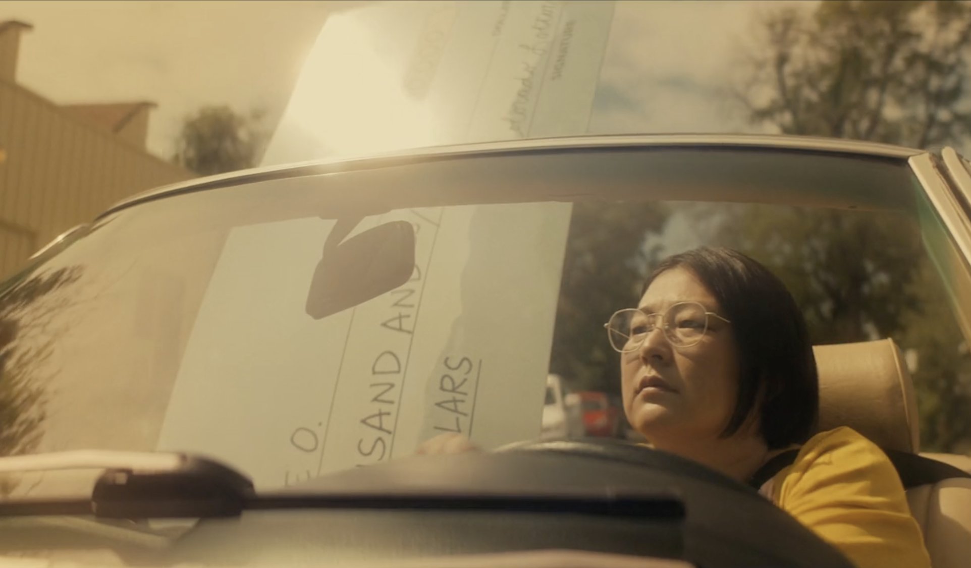
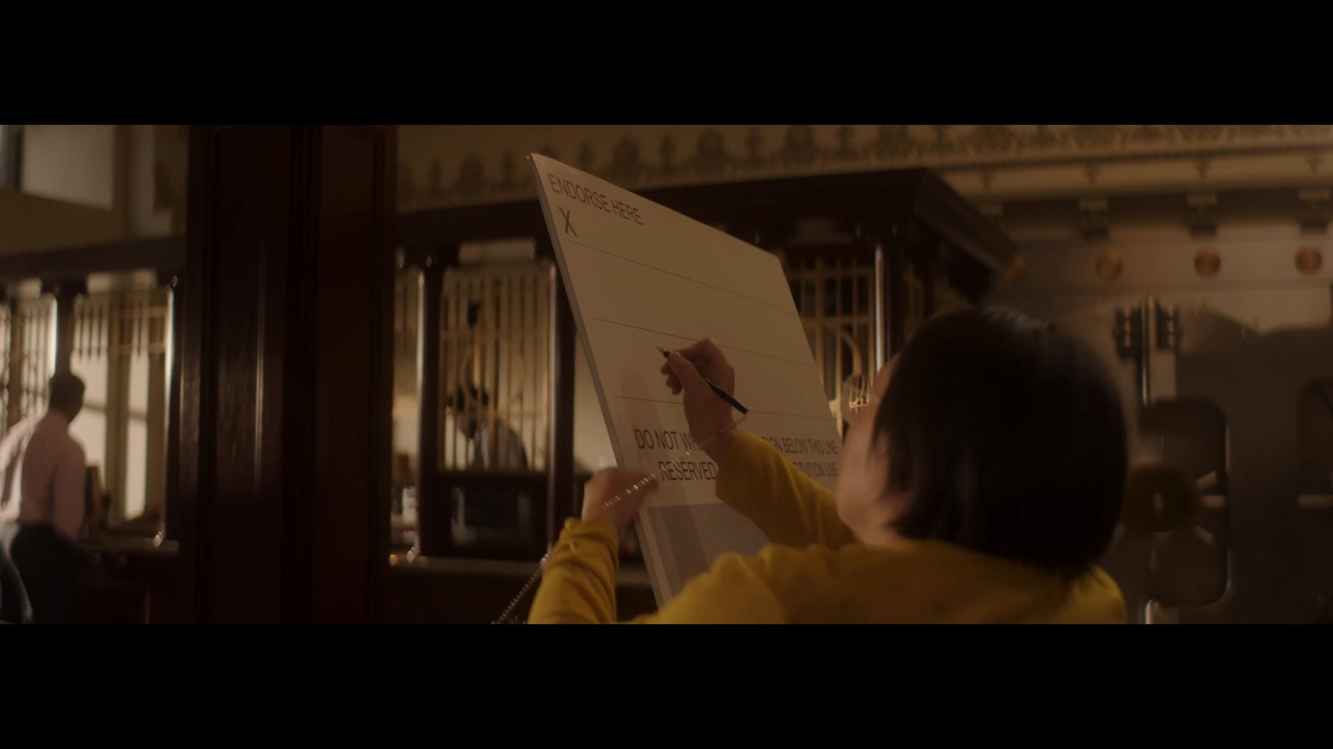
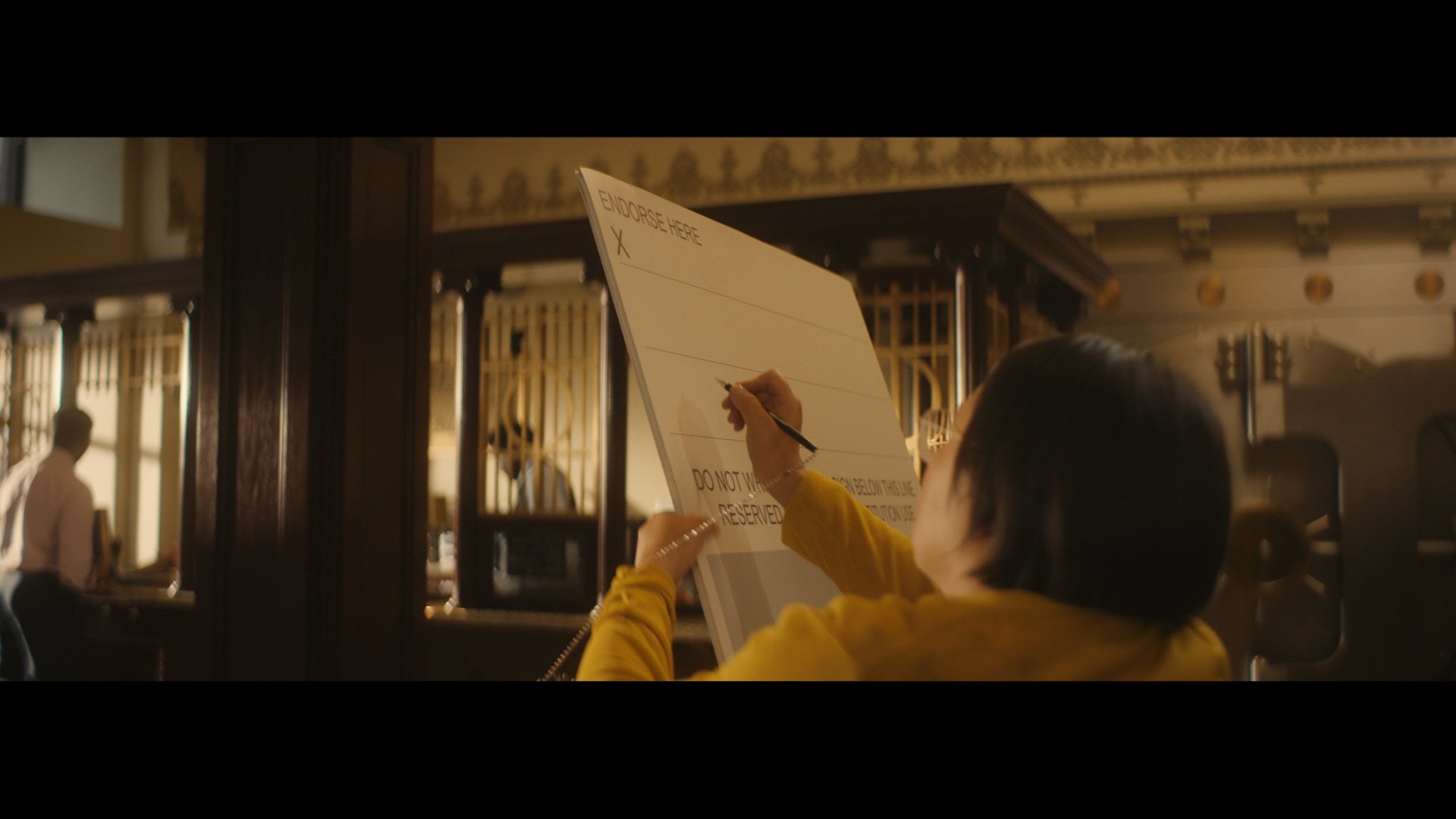
For the Colorado Lottery ‘Big Check’ spot, John Shea, VFX Artist, was tasked with updating a :30 and :15 second commercial. More specifically transitioning from “Set For Life” scratch cards to the new “Decade of Dollars” product. “This required not only re-creating the end tag with the new product imagery but also updating the hero prop, a giant check, with the new date, dollar amount, and product name” says Shea.
“The giant check being updated was the primary challenge in this project. Aside from it being a flexible cardboard object that is hand-held throughout, the check also appears through glass doors and a windshield which distorts the image a bit and poses some challenges both for motion tracking and for replicating the look and feel of the new text to what was shot practically. The spots also have some beautiful lens flares which needed to be replicated on top of the new text.”

Hover over image above to see before & after effects
Tap the image above to see before & after effects
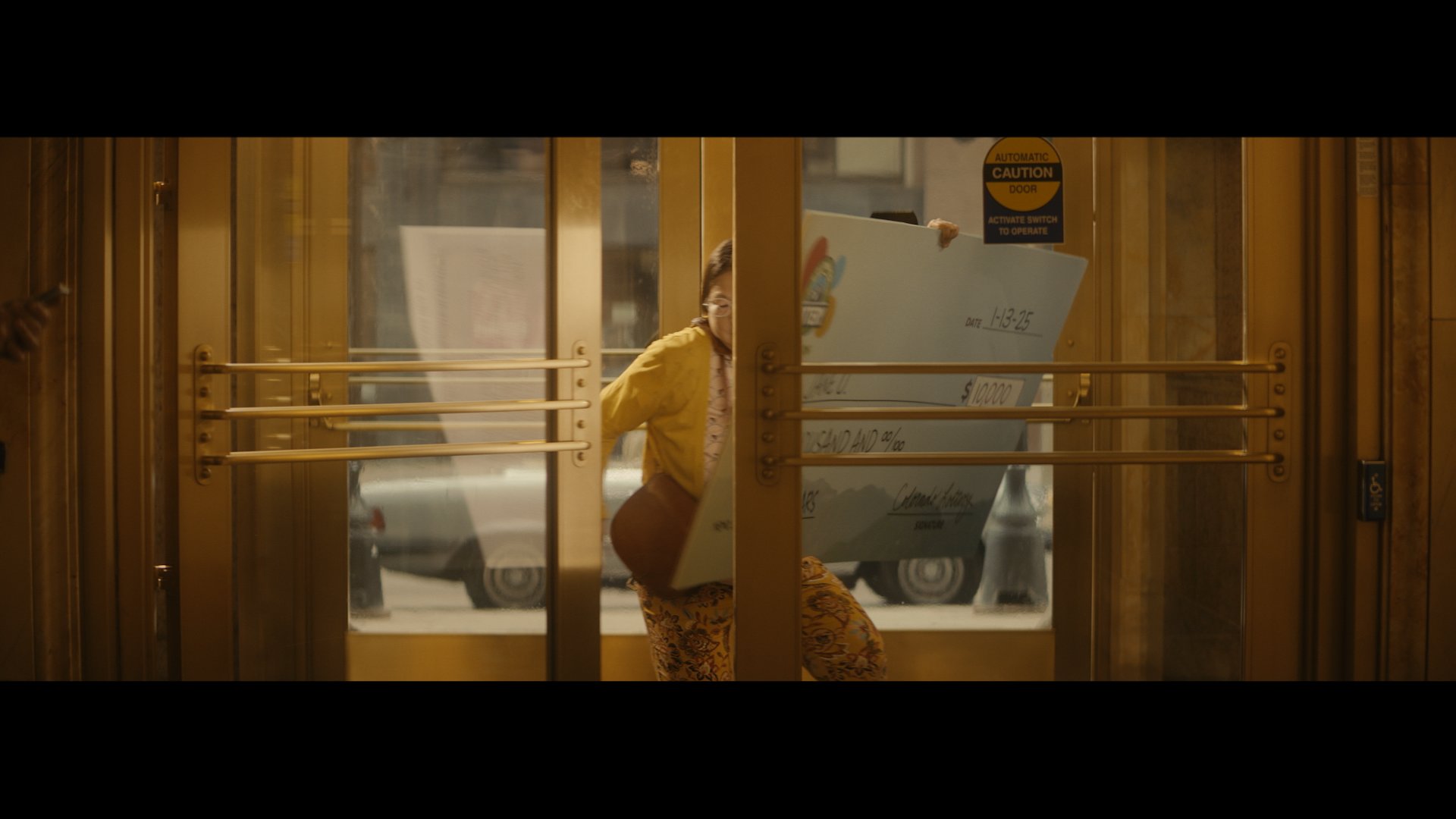
Shea shares one scene that he feels particularly proud of, “The two shots of the woman entering the bank though the glass doors were the most challenging. The goal was clearly to make it look exactly like it did but with all of the updates and I think we achieved that.”
Achieving the right results requires working as a collaborative team. Though this projects timing didn’t allow for pre-production collaboration, Shea strongly believes in the value of early VFX involvement “Proactive discussions with directors and DP’s during pre-production are essential for aligning creative vision, developing strategies for seamless VFX integration, and ensuring a smooth and efficient post-production process.”
Jonnie Sirotek, Colorist on this spot agrees. “By the time a spot hits my desk, it has been the cumulative effort of dozens if not hundreds of people to make it possible. As a Colorist, I try to bring my own experience and taste into every job to serve the story and elevate it a little further, and the best way I've found to do that is through open collaboration with other departments. Working directly with the Director, DP, or the creative team gives me a sense of what they were trying to achieve on set and helps me make choices that (hopefully!) further enhance the story.”
Sirotek worked as the Colorist as well as the online/Conform Artist on this spot. “My role was to do the color grade for the campaign, then put the finished pieces together to deliver the final files to broadcast,” says Sirotek.
Hover over image above to see before & after effects
Tap the image above to see before & after effects
When reflecting on the specific challenges of this project Sirotek mentions a certain tone
“The spots had a particular gold/yellow color that was established on set. We wanted to stay true to that look, but still bring out some skin tone, wardrobe, and the blues in the check to create a bit more depth and three-dimensionality which took some finesse from all of us.”
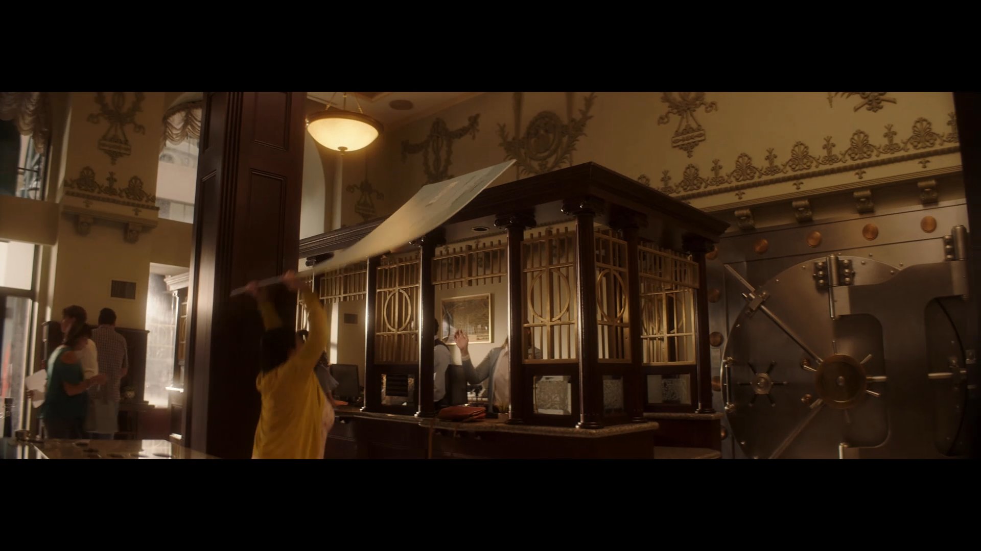
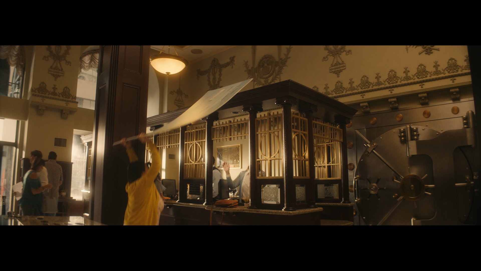
Sirotek had his own favorites when it came to this production “The scenes in the bank in particular were a lot of fun to grade. We used a few windows to help guide the audience to the performances, but it was all about the balance of the brass and wood tones in the bank against the actors and the props. The check became a bit of a character itself, so holding some blues and grays helped it pop a bit against the warmth of the world.”
Hover over image above to see before & after effects
Tap the image above to see before & after effects